
I do not know how it is in the other languages.
I had fun trying it out and going to stay with the original

Many mistakes but very funny in French too : one example ,Rick (signature ) has become 'meule' =hayrickJackGywer wrote: ↑Sat Sep 01, 2018 6:37 pm Okay, the language setting works, although the translation is a mixture of German and English, somewhat difficult to understand, because the syntax is also incorrect, but who can not understand English at all, it certainly helps.
I do not know how it is in the other languages.
I had fun trying it out and going to stay with the original
. No problem . I always read the English version anyway .
 But I may not be a measure of good eyesight!
You can breathe again , KateKateR wrote: ↑Fri Sep 14, 2018 7:02 pm I'm holding my breath...
I may have found a solution, but I'm afraid to touch anything for fear it will disappear.
Is this any better?
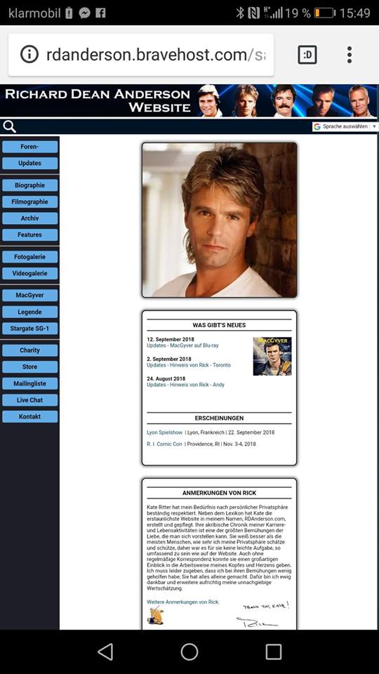
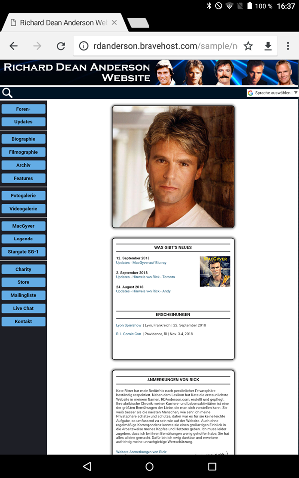
http://rdanderson.bravehost.com/new

